 Sarah Jacobson
Design choices shape what people do online. The layout of a page, the colours used, the way content flows; these details steer attention, guide actions, and influence decisions, often without users even realizing it.
A well-placed button, a clear path through the page, or the right contrast between elements can make the difference between a user clicking forward or closing the tab. Understanding how they work is key for anyone creating digital products that need to hold attention and drive results.
Layout Drives Action Before Users Even Think
The structure of a page decides what people see, where they go, and how quickly they get there. It’s the silent framework that makes digital experiences feel effortless or frustrating. When the layout is done right, users move without hesitation. When it’s messy, they leave.
Just look at how Spotify handles layout. The interface pushes users straight into action. New releases, personalised playlists, and search are all easy to reach. You don’t have to look for anything; it’s already in front of you. That simplicity keeps people engaged without slowing them down.
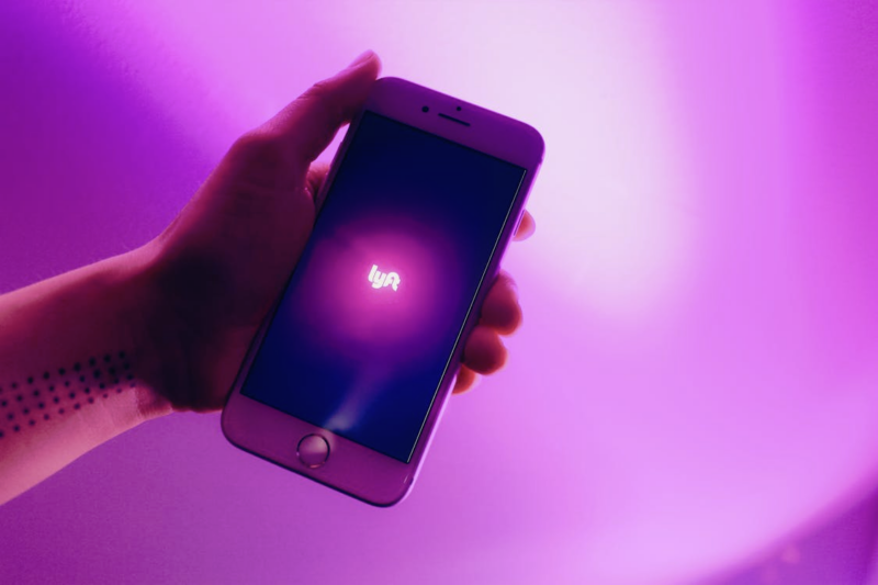
This same principle shows up across the online entertainment space, especially when you look at online betting platforms. The best ones are built so users can switch between sports, markets, and bet types in seconds. The design keeps options within reach, without making the screen feel crowded.
Another clear example is Duolingo. Lessons, goals, and progress tracking are layered in a way that pulls users forward step by step. You’re never guessing what to do next; the layout takes care of that.
Color Affects What People Feel
Color choices shape how people react. Certain tones convey comfort, urgency, or trust without a single word. Blue, for example, often makes people feel secure. That’s why it shows up so often in banking and tech interfaces. Red works differently. It draws attention and pushes for action, useful for time-limited offers or warnings that require quick responses.
These effects come down to how the brain processes colour. Warm tones like orange and yellow tend to catch the eye and add energy. That’s why they’re often used for buttons or alerts.
Cooler tones like green signal calm and are common in apps that focus on money or health, where users need a sense of clarity and control. The wrong mix can be distracting. Too much contrast or too many colours can feel overwhelming. A simple palette, applied consistently, helps users focus.
Contrast also plays a practical role. Clear separation between text and background makes content easier to read, especially on mobile or in low light. When that’s missing, users hesitate or leave halfway through a task.
Flow Decides Whether Users Stay or Drop Off
Flow is about guiding users from one step to the next without making them stop to think. It’s the quiet structure behind how people move through a page or an app. When that structure makes sense, users keep going. If it doesn’t, they leave.
Start with a basic path. On a news app, that could mean opening the app, reading a headline, then sharing the story. If the steps between those points are smooth (through clean transitions, gestures, or buttons), people are more likely to explore further. If they hit a dead end or can’t find the next step, they lose interest.
Mobile banking apps handle this well. After logging in, users can view account balances and make payments or transfers with a few clicks. Progress bars show how far along they are, cutting down uncertainty. That kind of feedback matters. It removes guesswork, which helps people feel in control of the process.
Flow breaks down when unnecessary steps get added or when options are hidden behind confusing menus. Fixing that takes real testing: watching what users actually do, not what designers expect them to do.
These Three Segments Should Always Work Together
Good design isn’t just about getting the parts right; it’s about making them work together. Layout gives shape to the experience. Colour sets the tone. Flow connects it all. When those elements align, users move through a site or app naturally, without needing instructions.
Travel booking sites are a clear example. A clean layout helps visitors scan through destinations. Bright images grab attention. Warm accent colours pull focus to deals and filters. The flow then takes users from searching to booking with clear steps and minimal friction. The process feels easy, which increases the chance they’ll follow through.
Productivity tools follow the same principle. Trello, for example, uses a card layout that keeps information tidy. Boards are colour-coded, helping teams prioritize work at a glance. Moving tasks between columns is simple and fluid. That kind of interaction feels natural, so people keep using it.
The risk comes when any one piece falls out of sync. A sharp layout can’t fix poor flow. Strong colour choices won’t help if the structure is confusing. Keeping all three elements aligned takes ongoing work: reviewing feedback, making adjustments, and watching how real users behave. When it’s done well, the result is a system that keeps people engaged from start to finish.
About Author